" height="48px" id="czyptE1Es" width="48px"/><path d="M 21.574 0 C 22.068 0 22.487 0.146 22.818 0.446 C 23.188 0.756 23.36 1.226 23.36 1.825 C 23.36 2.428 23.159 3.118 22.772 3.891 C 22.323 4.804 21.76 5.655 21.095 6.424 C 21.308 6.904 21.582 7.53 21.915 8.299 L 22.182 8.91 C 22.449 9.535 22.716 10.206 22.982 10.922 C 23.365 11.853 23.681 12.797 23.927 13.756 L 24.014 14.104 C 24.205 14.908 24.3 15.663 24.3 16.367 C 24.3 18.242 23.886 19.954 23.056 21.503 L 23.055 21.503 C 22.255 23.019 21.165 24.328 19.787 25.43 L 19.786 25.432 C 18.409 26.504 16.853 27.329 15.121 27.906 C 13.434 28.48 11.663 28.773 9.881 28.772 C 9.045 28.772 8.221 28.701 7.408 28.562 C 7.579 29.529 7.898 30.26 8.356 30.767 C 8.891 31.355 9.4 31.715 9.882 31.868 C 10.094 31.925 10.269 32 10.394 32.1 C 10.523 32.204 10.604 32.339 10.604 32.503 C 10.606 32.591 10.582 32.679 10.534 32.753 C 10.483 32.826 10.408 32.879 10.322 32.902 C 10.163 32.949 9.953 32.921 9.716 32.852 L 9.712 32.85 C 8.519 32.462 7.629 31.875 7.061 31.079 C 6.513 30.312 6.182 29.352 6.062 28.206 C 4.645 27.794 3.483 27.181 2.584 26.364 L 2.582 26.362 C 1.667 25.504 1 24.532 0.582 23.447 L 0.581 23.443 C 0.193 22.338 -0.003 21.175 0 20.003 C 0 18.677 0.249 17.431 0.749 16.267 L 0.749 16.265 C 1.262 15.122 1.98 14.083 2.865 13.197 C 3.717 12.309 4.73 11.592 5.85 11.084 C 6.929 10.565 8.11 10.294 9.308 10.294 C 10.385 10.294 11.344 10.459 12.182 10.793 L 12.487 10.913 C 13.13 11.179 13.677 11.513 14.126 11.912 C 14.988 11.027 15.869 10.16 16.769 9.314 C 17.611 8.526 18.42 7.704 19.196 6.852 C 19.031 6.351 18.876 5.846 18.731 5.339 L 18.73 5.332 C 18.589 4.731 18.519 4.116 18.521 3.5 C 18.521 2.379 18.859 1.502 19.554 0.895 C 20.225 0.308 20.899 0 21.574 0 Z M 19.587 8.116 C 18.89 8.856 18.169 9.572 17.426 10.265 C 16.603 11.061 15.793 11.87 14.996 12.691 C 15.554 13.273 15.97 13.893 16.235 14.555 C 16.511 15.235 16.653 15.961 16.655 16.694 C 16.655 17.701 16.402 18.665 15.9 19.585 L 15.899 19.586 C 15.395 20.482 14.681 21.208 13.76 21.765 C 12.861 22.326 11.798 22.603 10.576 22.603 C 10.212 22.603 9.849 22.576 9.49 22.521 C 9.155 22.468 8.823 22.396 8.497 22.306 C 8.195 23.033 7.927 23.883 7.696 24.857 C 7.465 25.834 7.333 26.71 7.297 27.486 C 7.634 27.577 7.971 27.649 8.308 27.697 L 8.307 27.697 C 8.693 27.75 9.083 27.777 9.473 27.778 C 11 27.778 12.49 27.403 13.942 26.65 C 15.388 25.904 16.689 24.905 17.784 23.701 C 18.889 22.489 19.654 21.214 20.082 19.876 L 20.083 19.873 C 20.568 18.419 20.81 16.869 20.81 15.223 C 20.807 13.999 20.685 12.777 20.446 11.575 L 20.446 11.572 C 20.241 10.402 19.954 9.247 19.587 8.116 Z M 10.167 11.657 C 9.215 11.657 8.3 11.906 7.422 12.411 C 6.566 12.92 5.788 13.589 5.09 14.421 C 4.394 15.247 3.823 16.171 3.395 17.162 L 3.395 17.164 C 2.964 18.131 2.71 19.069 2.63 19.976 C 2.63 20.087 2.615 20.208 2.59 20.339 L 2.59 20.698 C 2.59 21.554 2.71 22.426 2.952 23.312 L 3.05 23.627 C 3.288 24.349 3.646 25.025 4.11 25.628 L 4.325 25.877 C 4.814 26.401 5.407 26.815 6.067 27.094 C 6.139 26.205 6.285 25.324 6.506 24.46 L 6.506 24.456 L 6.507 24.456 C 6.768 23.516 7.055 22.638 7.367 21.821 C 6.882 21.521 6.503 21.146 6.236 20.692 C 5.952 20.21 5.806 19.721 5.806 19.226 C 5.806 18.278 6.199 17.561 6.983 17.096 L 7.101 17.035 C 7.216 16.981 7.342 16.953 7.469 16.952 C 7.592 16.952 7.712 16.975 7.804 17.044 C 7.904 17.119 7.946 17.229 7.946 17.348 C 7.946 17.548 7.811 17.75 7.616 17.945 L 7.612 17.948 L 7.607 17.951 C 7.23 18.278 7.046 18.674 7.046 19.145 C 7.046 19.743 7.309 20.239 7.856 20.636 C 8.548 19.094 9.406 17.633 10.415 16.277 L 10.813 15.752 C 11.635 14.675 12.504 13.634 13.418 12.632 C 12.902 12.263 12.381 12.017 11.852 11.897 L 11.843 11.896 C 11.298 11.738 10.734 11.657 10.167 11.656 Z M 14.288 13.453 C 13.276 14.568 12.323 15.734 11.432 16.946 C 10.452 18.275 9.618 19.706 8.945 21.214 C 9.264 21.291 9.593 21.328 9.922 21.323 C 10.809 21.326 11.677 21.064 12.415 20.571 C 13.209 20.044 13.877 19.349 14.372 18.535 C 14.877 17.713 15.128 16.855 15.128 15.958 C 15.126 15.502 15.046 15.049 14.891 14.62 L 14.888 14.612 C 14.76 14.193 14.556 13.8 14.288 13.453 Z M 21.86 1.076 C 21.665 1.076 21.406 1.238 21.081 1.67 C 20.639 2.267 20.417 2.984 20.417 3.827 C 20.417 4.263 20.489 4.689 20.635 5.109 C 21.046 4.539 21.412 3.937 21.727 3.309 C 21.914 2.935 22.031 2.621 22.082 2.367 L 22.083 2.357 L 22.084 2.357 C 22.164 2.064 22.201 1.833 22.201 1.662 C 22.201 1.429 22.161 1.28 22.103 1.193 C 22.053 1.118 21.98 1.076 21.86 1.076 Z" fill="rgb(255, 255, 255)" height="32.925060768879945px" id="oGcyViHv7" stroke-dasharray="" stroke-linecap="butt" stroke-linejoin="miter" stroke-miterlimit="10" stroke-width="0.4" stroke="rgb(255, 255, 255)" transform="translate(12 7.5)" width="24.300031668843673px"/></g></svg>)
Building a Scalable Design System for a Growing Product Organization
I helped build and scale multiple design systems—leading some from inception and contributing to others—while working closely with design and engineering to establish shared patterns. We set up solid foundations, built reusable components, and wrote clear documentation. This helped us reduce UI inconsistencies, work faster, and establish a common product language as the company grew.
I improved the design system by creating reusable templates from core components. This sped up the design process and helped keep the UI more consistent and high-quality.
Role & Context
Role: Sn. Product Designer
Audited existing UI and components
Defined design principles and system foundations
Designed and documented reusable components
Partnered closely with engineers on implementation
Evangelized adoption across teams
The Problem
Here’s what things looked like before we had the design system:
❌ UI patterns were inconsistent across different features and platforms
❌ Designers had to rebuild components from scratch each time
❌ Engineers built similar components in different ways
❌ New designers and developers took longer to get started
❌ Teams kept debating the same design decisions instead of reusing solutions
As highlighted by Mind the Product, lack of a design system doesn’t just affect aesthetics—it directly impacts product quality, speed, and trust.
Goals
Establish a single source of truth for UI components and patterns.
Enhance the efficiency of the design-to-development handoff.
Support scalable product development across multiple teams.
Foster a shared language among design, product, and engineering teams.
Process
UI & Workflow Audit
I completed a cross-product audit to identify the following issues:
Duplicate components that showed visual or behavioral inconsistencies
Inconsistent use of spacing, typography, and color
Common design patterns are implemented inconsistently across the team.
Insight:
The primary challenge was not creativity, but a lack of alignment.

Before → After
Foundations First
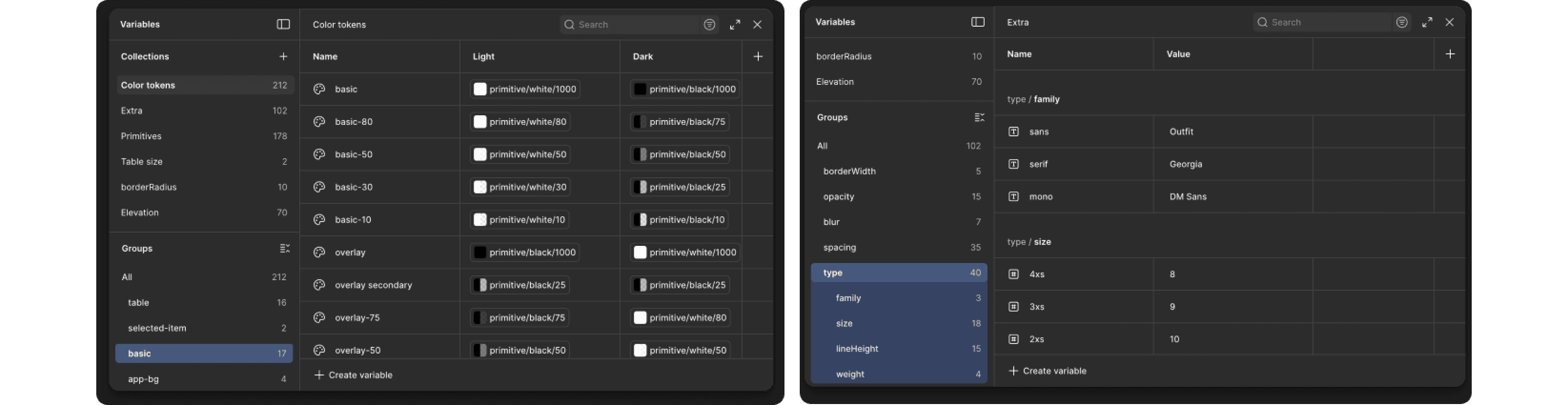
Color system with semantic naming
Typography scale tied to use cases
Spacing and layout rules
Accessibility standards baked in
These decisions reduced subjective debates and anchored future components.
3. Component System
I designed a flexible, token-based component library:
Buttons, inputs, modals, navigation
Variants and states are clearly defined
Responsive and accessible by default
Each component was:
Documented with usage guidelines
Linked to live code equivalents
Designed to scale, not just ship

Collaboration with Engineering
Rather than following a traditional design handoff, we worked alongside engineering simultaneously.
We used the same naming conventions in both Figma and our code.
We built each component once and reused it throughout the project.
We set up regular feedback loops between design and implementation.
A design system should be seen as a tool for collaboration, not just a design artifact.
Documentation & Adoption
To help the team get started with the system, I took these steps:
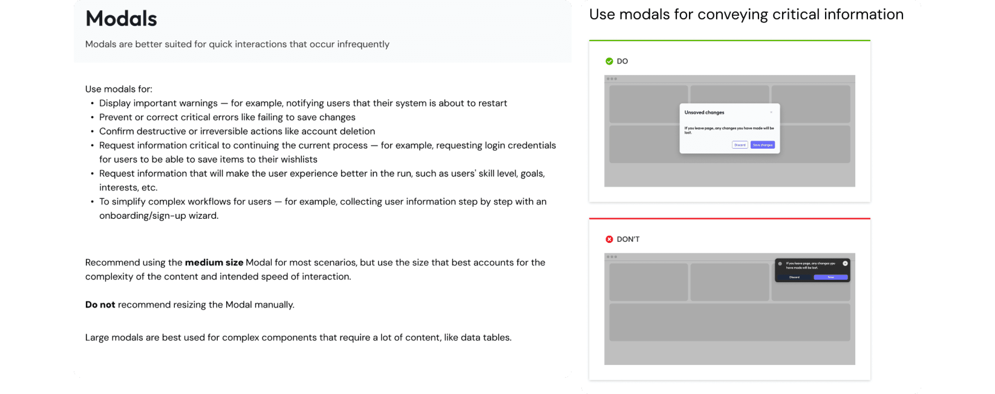
I created clear guidelines and added examples showing what to do and what to avoid.
I explained why key decisions were made.
I ran onboarding sessions for designers and engineers.
A design system works only when people trust it.
Trade-offs & Constraints
Some legacy components had to stay in place for now.
Teams needed flexibility, since too many rules would slow down innovation.
Adoption of the new system requires changes to existing workflows, rather than simply providing new files.
The system was intentionally designed to be both opinionated and extensible.
From Components to Templates
To make things easier and more consistent, I turned core components into reusable layout templates for common workflows. These templates gave a clear structure but stayed flexible for different products. By handling repeated layout choices up front, designers could spend more time on user needs and interaction quality instead of rebuilding UI patterns.
As a result, design iterations were faster, user experiences became more consistent, and accessibility improved by default.
Recognition & Scale Impact at Eptura
While working on Eptura’s design team, I helped build and improve a shared design system. This system made user experiences more consistent across our many products. It also made teamwork easier and helped us support over 16.3 million users by reducing confusion and improving collaboration.
Our work was recognized outside the company when we were nominated for the Zeroheight Design System Award (Best Governance). This nomination showed the strength of our team’s approach, which balanced consistency and flexibility, clarified ownership, and helped teams around the world use the system over time.
This recognition showed that design systems are more than just a collection of parts. They serve as a shared foundation for teams to make decisions and grow together.