" height="48px" id="czyptE1Es" width="48px"/><path d="M 21.574 0 C 22.068 0 22.487 0.146 22.818 0.446 C 23.188 0.756 23.36 1.226 23.36 1.825 C 23.36 2.428 23.159 3.118 22.772 3.891 C 22.323 4.804 21.76 5.655 21.095 6.424 C 21.308 6.904 21.582 7.53 21.915 8.299 L 22.182 8.91 C 22.449 9.535 22.716 10.206 22.982 10.922 C 23.365 11.853 23.681 12.797 23.927 13.756 L 24.014 14.104 C 24.205 14.908 24.3 15.663 24.3 16.367 C 24.3 18.242 23.886 19.954 23.056 21.503 L 23.055 21.503 C 22.255 23.019 21.165 24.328 19.787 25.43 L 19.786 25.432 C 18.409 26.504 16.853 27.329 15.121 27.906 C 13.434 28.48 11.663 28.773 9.881 28.772 C 9.045 28.772 8.221 28.701 7.408 28.562 C 7.579 29.529 7.898 30.26 8.356 30.767 C 8.891 31.355 9.4 31.715 9.882 31.868 C 10.094 31.925 10.269 32 10.394 32.1 C 10.523 32.204 10.604 32.339 10.604 32.503 C 10.606 32.591 10.582 32.679 10.534 32.753 C 10.483 32.826 10.408 32.879 10.322 32.902 C 10.163 32.949 9.953 32.921 9.716 32.852 L 9.712 32.85 C 8.519 32.462 7.629 31.875 7.061 31.079 C 6.513 30.312 6.182 29.352 6.062 28.206 C 4.645 27.794 3.483 27.181 2.584 26.364 L 2.582 26.362 C 1.667 25.504 1 24.532 0.582 23.447 L 0.581 23.443 C 0.193 22.338 -0.003 21.175 0 20.003 C 0 18.677 0.249 17.431 0.749 16.267 L 0.749 16.265 C 1.262 15.122 1.98 14.083 2.865 13.197 C 3.717 12.309 4.73 11.592 5.85 11.084 C 6.929 10.565 8.11 10.294 9.308 10.294 C 10.385 10.294 11.344 10.459 12.182 10.793 L 12.487 10.913 C 13.13 11.179 13.677 11.513 14.126 11.912 C 14.988 11.027 15.869 10.16 16.769 9.314 C 17.611 8.526 18.42 7.704 19.196 6.852 C 19.031 6.351 18.876 5.846 18.731 5.339 L 18.73 5.332 C 18.589 4.731 18.519 4.116 18.521 3.5 C 18.521 2.379 18.859 1.502 19.554 0.895 C 20.225 0.308 20.899 0 21.574 0 Z M 19.587 8.116 C 18.89 8.856 18.169 9.572 17.426 10.265 C 16.603 11.061 15.793 11.87 14.996 12.691 C 15.554 13.273 15.97 13.893 16.235 14.555 C 16.511 15.235 16.653 15.961 16.655 16.694 C 16.655 17.701 16.402 18.665 15.9 19.585 L 15.899 19.586 C 15.395 20.482 14.681 21.208 13.76 21.765 C 12.861 22.326 11.798 22.603 10.576 22.603 C 10.212 22.603 9.849 22.576 9.49 22.521 C 9.155 22.468 8.823 22.396 8.497 22.306 C 8.195 23.033 7.927 23.883 7.696 24.857 C 7.465 25.834 7.333 26.71 7.297 27.486 C 7.634 27.577 7.971 27.649 8.308 27.697 L 8.307 27.697 C 8.693 27.75 9.083 27.777 9.473 27.778 C 11 27.778 12.49 27.403 13.942 26.65 C 15.388 25.904 16.689 24.905 17.784 23.701 C 18.889 22.489 19.654 21.214 20.082 19.876 L 20.083 19.873 C 20.568 18.419 20.81 16.869 20.81 15.223 C 20.807 13.999 20.685 12.777 20.446 11.575 L 20.446 11.572 C 20.241 10.402 19.954 9.247 19.587 8.116 Z M 10.167 11.657 C 9.215 11.657 8.3 11.906 7.422 12.411 C 6.566 12.92 5.788 13.589 5.09 14.421 C 4.394 15.247 3.823 16.171 3.395 17.162 L 3.395 17.164 C 2.964 18.131 2.71 19.069 2.63 19.976 C 2.63 20.087 2.615 20.208 2.59 20.339 L 2.59 20.698 C 2.59 21.554 2.71 22.426 2.952 23.312 L 3.05 23.627 C 3.288 24.349 3.646 25.025 4.11 25.628 L 4.325 25.877 C 4.814 26.401 5.407 26.815 6.067 27.094 C 6.139 26.205 6.285 25.324 6.506 24.46 L 6.506 24.456 L 6.507 24.456 C 6.768 23.516 7.055 22.638 7.367 21.821 C 6.882 21.521 6.503 21.146 6.236 20.692 C 5.952 20.21 5.806 19.721 5.806 19.226 C 5.806 18.278 6.199 17.561 6.983 17.096 L 7.101 17.035 C 7.216 16.981 7.342 16.953 7.469 16.952 C 7.592 16.952 7.712 16.975 7.804 17.044 C 7.904 17.119 7.946 17.229 7.946 17.348 C 7.946 17.548 7.811 17.75 7.616 17.945 L 7.612 17.948 L 7.607 17.951 C 7.23 18.278 7.046 18.674 7.046 19.145 C 7.046 19.743 7.309 20.239 7.856 20.636 C 8.548 19.094 9.406 17.633 10.415 16.277 L 10.813 15.752 C 11.635 14.675 12.504 13.634 13.418 12.632 C 12.902 12.263 12.381 12.017 11.852 11.897 L 11.843 11.896 C 11.298 11.738 10.734 11.657 10.167 11.656 Z M 14.288 13.453 C 13.276 14.568 12.323 15.734 11.432 16.946 C 10.452 18.275 9.618 19.706 8.945 21.214 C 9.264 21.291 9.593 21.328 9.922 21.323 C 10.809 21.326 11.677 21.064 12.415 20.571 C 13.209 20.044 13.877 19.349 14.372 18.535 C 14.877 17.713 15.128 16.855 15.128 15.958 C 15.126 15.502 15.046 15.049 14.891 14.62 L 14.888 14.612 C 14.76 14.193 14.556 13.8 14.288 13.453 Z M 21.86 1.076 C 21.665 1.076 21.406 1.238 21.081 1.67 C 20.639 2.267 20.417 2.984 20.417 3.827 C 20.417 4.263 20.489 4.689 20.635 5.109 C 21.046 4.539 21.412 3.937 21.727 3.309 C 21.914 2.935 22.031 2.621 22.082 2.367 L 22.083 2.357 L 22.084 2.357 C 22.164 2.064 22.201 1.833 22.201 1.662 C 22.201 1.429 22.161 1.28 22.103 1.193 C 22.053 1.118 21.98 1.076 21.86 1.076 Z" fill="rgb(255, 255, 255)" height="32.925060768879945px" id="oGcyViHv7" stroke-dasharray="" stroke-linecap="butt" stroke-linejoin="miter" stroke-miterlimit="10" stroke-width="0.4" stroke="rgb(255, 255, 255)" transform="translate(12 7.5)" width="24.300031668843673px"/></g></svg>)

Role & Context
Role: Product Design Lead
Product Area: Portfolio Analytics & Investment Exposure Visualization
Primary Users: Portfolio Managers, Investment Analysts, Financial Advisors
Scope: Institutional and advisory investment teams managing multi-asset portfolios across sectors, geographies, and hierarchical asset structures
Overview
Exposure Time-Series is a portfolio analytics experience designed to help institutional investors and advisors understand how asset exposure evolves over time. The original experience relied on a single stacked area chart that was visually dense, hard to interpret, and offered limited insight beyond high-level trends.
My goal was to transform this into a decision-support tool—one that enables users to explore exposure changes across time, drill into structure, and compare entities with confidence.
The Problem
The existing exposure chart had several usability and analytical issues:
Overloaded stacked area chart
Difficult to compare individual asset classes
Small changes were visually lost
Low information density
The chart showed what changed, but not why
Rigid hierarchy
.Users could not easily regroup data (e.g., Sector → Country → Industry)
Poor scalability
As portfolios became more complex, readability degraded quickly
As a result, users relied on exports or external tools to answer basic questions.
Core questions users needed answered
How has exposure shifted over time?
Which assets are driving change?
What happens if I regroup the same data differently?
Can I compare entities without visual noise?
Constraints & Considerations
Regulatory & Compliance
I had to ensure that financial data and exposure calculations complied with strict regulatory requirements, which limited how I could transform, aggregate, or visually approximate data.
I needed to ensure that my visualizations preserved numerical accuracy and avoided misleading representations, especially when comparing stacked versus unstacked values.
Data Latency & Availability
Since exposure data was not real-time and only updated at defined reporting intervals, I needed to design the UI to clearly communicate time ranges and avoid implying live market behavior.
The large volume of historical data influenced my decisions around default time windows and progressive data loading.
Performance & Scale
Portfolios often included hundreds of entities across multiple hierarchical levels, which created performance constraints for rendering interactive time-series charts.
I balanced analytical depth with responsiveness in my visualization choices, favoring progressive disclosure, selective rendering, and user-driven drill-down over showing all data at once.
Cognitive Load & Interpretability
As a financial user who requires precision but is often time-constrained, I designed interactions to surface insights quickly without requiring manual data manipulation or exports.
Goals
Make exposure trends legible at a glance
Support progressive disclosure from overview → detail
Enable flexible grouping and regrouping
Preserve analytical accuracy without overwhelming users
Support both trend analysis and comparison tasks
Solution Overview
I updated the experience to include two visualization modes that work well together, along with features for dynamic grouping and drill-down.
Dual Visualization Modes
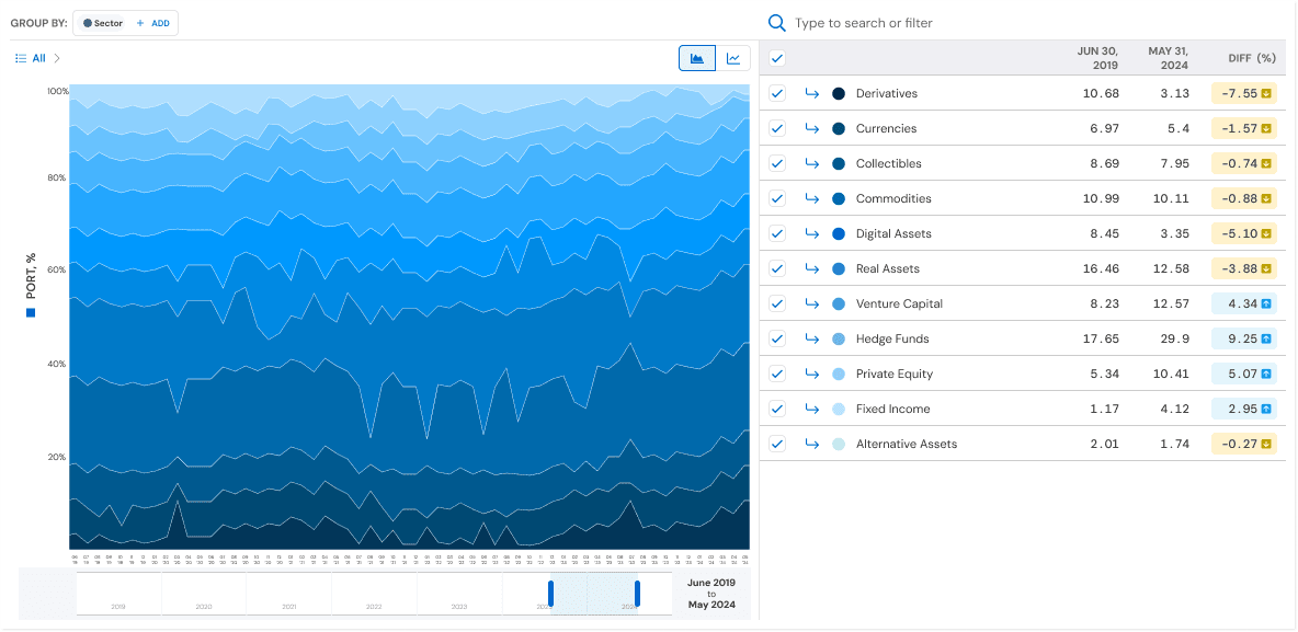
Area Chart — Portfolio Composition Over Time
Improvements
Clearer color hierarchy
Better stacking logic to preserve relative weight
Used primarily to understand portfolio composition and macro trends
When it’s best
Answering: “How is my portfolio allocated over time?”
Spotting long-term shifts in exposure mix

Line Charts — Comparative & Analytical View
I added a line chart view to improve comparison and precision, offering another way to view the same data.
Why line charts
Easier comparison across entities
Clear visibility into volatility and inflection points
Scales better as the number of entities grows
Enhancements
Hover interactions for exact values
Isolated lines reduce visual noise
Enables side-by-side comparison without stacking bias
When it’s best
Answering: “Which assets changed the most?”
Comparing exposure trajectories across entities

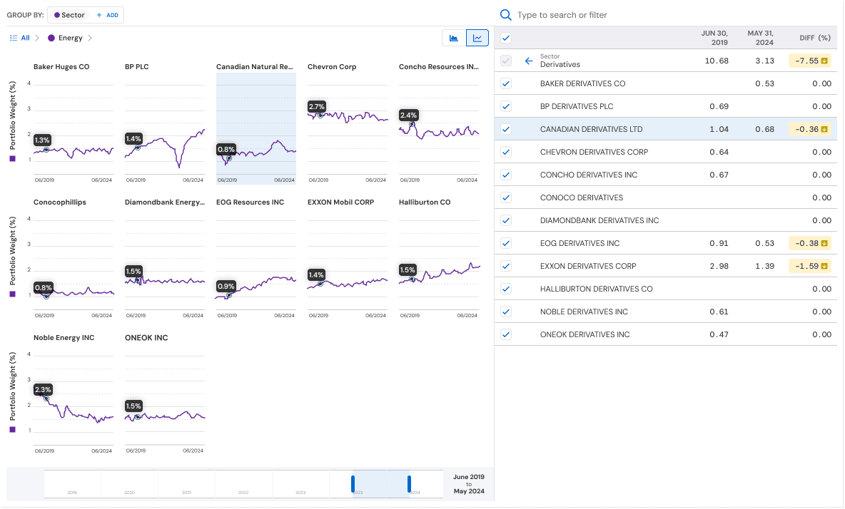
Multi-Level Grouping & Regrouping
One of the most impactful changes was allowing users to dynamically group and regroup exposure data.
Supported grouping levels
Asset class
Sector
Country
Industry
Company
Users can:
Group at one level (e.g., Sector)
Drill down into a subset (e.g., Energy → Companies)
Regroup the same data without resetting context
This turned a static chart into an explorable analytical surface.
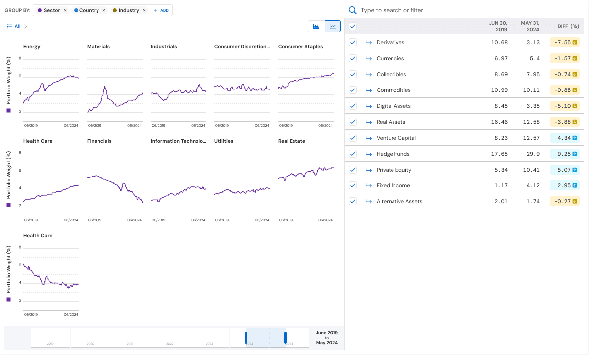
Progressive Drill-In
The experience supports progressive disclosure:
Start with high-level exposure
Select a segment or entity
Drill into deeper levels
Instantly see how the same time series behaves at a different granularity
This reduced the need for:
Separate reports
Manual filtering workflows
External data exports

Interaction Highlights
Toggle between Area and Line views without data loss
Hover to reveal precise values
Checkbox-based entity selection for focused analysis
Time-range control to isolate specific periods
All interactions were designed to feel analyst-grade but approachable.
Trade-Offs & Constraints
Comparing stacked area charts and their ability to show differences between data sets
Kept area charts because they make it easier to see how different parts contribute to the whole.
Added line charts to improve accuracy and make it easier to compare data points.
Performance limitations
Balanced how complex the visuals are with the need for fast, real-time updates.
Limits on color choices
Made sure the charts are accessible, even when showing many different items.
What users in this field expect
Financial users need precise information, so we focused on making interactions clear instead of adding extra visual elements.
Impact and Outcomes
It is now easier to analyze exposure changes, reducing cognitive effort for users.
Users can now answer complex, multi-dimensional questions from a single view.
Users feel more confident when interpreting portfolio data.
Created a scalable approach that can be used for future analytics tools.
Although I did not have direct adoption metrics, internal feedback showed:
Analysis workflows are now faster.
Users need to export data less often.
Teams are better aligned when discussing exposure.